Colors are insubstantial, cannot change state, have no structure, do not belong to objects or events, and are results not processes {color facts}.
number of colors
Colors range continuously from red to scarlet, vermilion, orange, yellow, chartreuse, green, spring green, cyan, turquoise, blue, indigo, violet, magenta, crimson, and back to red. People can distinguish 150 to 200 main colors and seven million different colors.
discrimination
Humans can discriminate colors better from cyan to orange than from cyan through blues, purples, and reds.
people see same spectrum
Different humans see similar color spectra, with same colors and color sequence. Adults, infants, and animals see similar color spectra. Colorblind people have consistent but incomplete spectra.
purity
For each person, under specific viewing conditions, blue, green, and yellow can appear pure, with no other colors, but red does not appear pure.
location
Colors appear on surfaces.
adjacency
Adjacent colors affect each other and enhance contrast.
metamerism
Identical objects can have different colors. Different spectra can have the same color {metamerism}.
hue
Colors have hue. Colors respond differently as hue changes. Reds and blues change more slowly than greens and yellows.
brightness
Colors have brightness (lightness) or absence of black.
opaqueness
Colors have opaqueness. Transparency means no color.
saturation
Colors have saturation or absence of white. Different hues have different saturability and number of saturation levels.
emotion
Psychologically, red is alerting color. Green is neutral color. Blue is calming color.
depth
Blue objects appear to go farther away and expand, and red objects appear to come closer and contract, because reds appear lighter and blues darker.
Color can have shallow or deep depth. Yellow is shallow. Green is medium deep. Blue and red are deep.
lightness
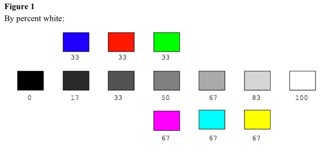
Dark colors are sad because darker, and light colors are glad because lighter. Yellow is the lightest color, comparable to white. Colors darken from yellow toward red. Red is lighter than blue but darker than green. Colors darken from yellow toward green and blue. Green is lighter than blue, which is comparable to black. Therefore, subjective lightness increases from blue to red to green to yellow. See Figure 1. Lightness relates directly to transparency, unsaturability, and sparseness. Blue is dark, opaque, saturable, and dense. Red is lighter, less opaque, less saturable, and less dense. Green is light, more transparent, unsaturable, and sparse. Yellow is lightest, most transparent, most unsaturable, and sparsest.
Blue is similar to dark gray. Red is similar to medium gray. Green is similar to gray. Yellow is similar to very light gray. Magenta is similar to gray. Cyan is similar to light gray. See Figure 1.
temperature
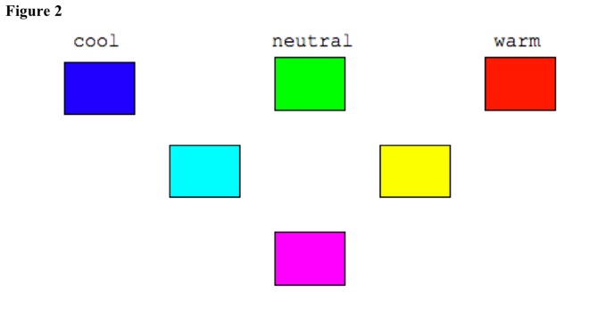
Colors can be relatively warm or cool. Blue is coolest, then green, then yellow, and then red [Hardin, 1988]. White, gray, and black, as color mixtures, have no net temperature. Temperature relates directly to sharpness, emotion level, expansion, size, and motion toward observer. Blue is cool, is sharp and crisp, causes calmness, seems to recede, and appears contracting and smaller than red. Green has neutral temperature, is less sharp and less crisp, has neutral emotion, neither recedes nor approaches, and is neither smaller nor larger. Red is warm, is not sharp and not crisp, causes excitement, seems to approach, and appears expanding and larger than blue. See Figure 2. Red and blue are approximately equally far away from green, so green is average. Magenta has neutral temperature, because it averages red and blue. Cyan is somewhat cool, because it averages green and blue. Yellow is somewhat warm, because it averages green and red. Black, grays, and white have neutral temperature, because mixing red, green, and blue makes average temperature.
Warmness-coolness, excitement-calmness, approach-recession, expansion-contraction, and largeness-smallness relate to attention level, so temperature property relates to salience.
change
Colors change with illumination intensity, illumination spectrum, background surface, adjacent surface, distance, and viewing angle.
constancy
Vision tries to keep surface colors constant, by color constancy processes, as illumination brightness and spectra change.
white
White is relatively higher in brightness than adjacent surfaces. High colored-light intensity makes white.
black
Black is relatively lower in brightness than adjacent surfaces. Black is not absence of visual sense qualities but is a color. Low colored-light intensity makes black.
gray
Gray is relatively the same brightness as adjacent surfaces. Increasing gray intensity makes white. Decreasing gray intensity makes black. Increasing black intensity or decreasing white intensity makes gray.
red
Red light is absence of blue and green. Red pigment is absence of green, its subtractive complementary color. Red is alerting color. Red is warm color, not cool color. Red has average lightness. Red mixes with white to make pink. Spectral red blends with spectral cyan to make white. Pigment red blends with pigment green to make black. Spectral red blends with spectral yellow to make orange. Pigment red blends with pigment yellow to make brown. Spectral red blends with spectral blue or violet to make purples. Pigment red blends with pigment blue or violet to make purples. People do not see red as well at farther distances. People do not see red as well at visual periphery. Red has widest color range. Red can fade in intensity to brown then black.
blue
Blue light is absence of red and green. Blue pigment is absence of red and green. Blue is calming color. Blue is cool color, not warm color. Blue is dark color. Blue mixes with white to make pastel blue. Spectral blue blends with spectral yellow to make white. Pigment blue blends with pigment yellow to make black. Spectral blue blends with spectral green to make cyan. Pigment blue blends with pigment green to make dark blue-green. Spectral blue blends with spectral red to make purples. Pigment blue blends with pigment red to make purples. People see blue well at farther distances. People see blue well at visual periphery. Blue has narrow color range.
green
Green light is absence of red and blue. Green pigment is absence of red. Green is neutral color in alertness. Green is cool color. Green is light color. Green mixes with white to make pastel green. Spectral green blends with spectral magenta to make white. Pigment green blends with pigment magenta to make black. Spectral green blends with spectral orange to make yellow. Pigment green blends with pigment orange to make brown. Spectral green blends with spectral blue to make cyan. Pigment green blends with pigment blue to make dark blue-green. People see green OK at farther distances. People do not see green well at visual periphery. Green has wide color range.
yellow
Yellow light is absence of blue. Yellow pigment is absence of indigo or violet. Yellow is neutral color in alertness. Yellow is warm color. Yellow is lightest color. Yellow mixes with white to make pastel yellow. Spectral yellow blends with spectral blue to make white. Pigment yellow blends with pigment blue to make green. Spectral yellow blends with spectral red to make orange. Pigment yellow blends with pigment red to make brown. Olive is dark yellow-green or less saturated yellow. People see yellow OK at farther distances. People do not see yellow well at visual periphery. Yellow has narrow color range.
orange
Spectral orange can mix red and yellow. Pigment orange can mix red and yellow. Orange is slightly alerting color. Orange is warm color. Orange is light color. Orange mixes with white to make pastel orange. Spectral orange blends with spectral blue-green to make white. Pigment orange blends with pigment blue-green to make black. Spectral orange blends with spectral cyan to make yellow. Pigment orange blends with pigment cyan to make brown. Spectral orange blends with spectral red to make light red-orange. Pigment orange blends with pigment red to make dark red-orange. People do not see orange well at farther distances. People do not see orange well at visual periphery. Orange has narrow color range.
violet
Spectral violet can mix blue and red. Pigment violet has red and so is purple. Violet is calming color. Violet is cool color. Violet is dark color. Violet mixes with white to make pastel violet. Spectral violet blends with spectral yellow-green to make white. Pigment violet blends with pigment yellow-green to make black. Spectral violet blends with spectral red to make purples. Pigment violet blends with pigment red to make purples. People see violet well at farther distances. People see violet well at visual periphery. Violet has narrow color range. Violet can fade in intensity to dark purple then black.
brown
Pigment brown can mix red, yellow, and green. Brown is commonest color but is not spectral color. Brown is like dark orange pigment or dark yellow-orange. Brown color depends on contrast and surface texture. Brown is not alerting or calming. Brown is warm color. Brown is dark color. Brown mixes with white to make pastel brown. Pigment brown blends with other pigments to make dark brown or black. People do not see brown well at farther distances. People do not see brown well at visual periphery. Brown has wide color range.
Consciousness>Consciousness>Speculations>Sensation>Psychology>Sense>Vision
1-Consciousness-Speculations-Sensation-Psychology-Sense-Vision
Outline of Knowledge Database Home Page
Description of Outline of Knowledge Database
Date Modified: 2022.0224